A closer look at the Millinery Shop.
Mr. Stowe, a wise business man, was determined to move his insurance business to the rear of his building on Maple Street, and rent the front of a building to another business. When I heard of his intentions, I knew this was the perfect opportunity for my millinery business. I promptly conveyed my interest in the space and have been quite pleased with the arrangement.
I must say though, despite his plan, Mr. Stowe was quite beside himself as the the war raged closer and closer. I don’t think I have ever heafd him so quiet. He is usually such a talkative, if occasionally shy, man. He was so worried about the damages resulting of the approaching fighting.
But, I digress.
You are intersted in the shop itself. As you can see, the front of the Insurance Office is a nice, space. It is positioned on a busy street in the village. The front room has two windows that provide nice light for the whole duration of the day, az long as the sun it out. It also has trees for shade. The porch is welcoming outside, while the beautiful mantle inside is both functional and esthetic.
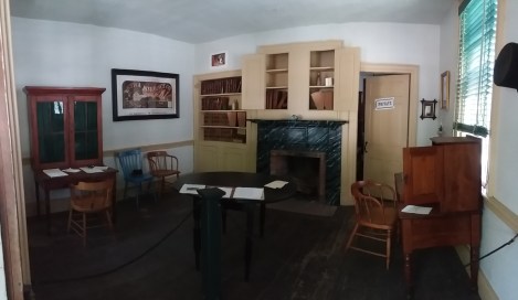
The space transformed quite well for my Millinery Shop.
There is just the right amount of space for organized work and consultations for customers. We have found it is quite comfortable for several women to hide upon the floor when it is not safe to go outside.
——————————————————————————————–
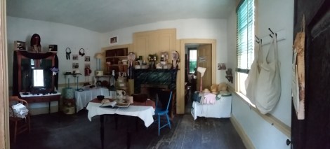
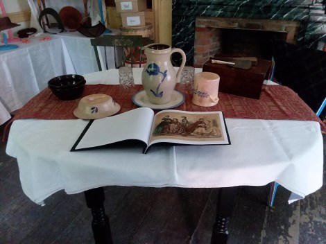
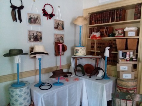
The center of the room was our work space. This is the oval table that belongs in this space. It is a good size, being not too big nor too small. We generally work from the runner back. From the runner forward is meant to be interactive pieces. I did a sample book of fashion illustrations this year. In previous years, I set out straw samples. The book did not get as much attention as I anticipated. I think cards may get more attention, paired with straw and ribbon samples. As you can see, I also put the food on the table. If it isn’t right there, I will completely forget to eat until it is too late.
A good many of the museum visitors for this event are families with children. It is important to me to have items at their level that they can touch. The layout of the room makes two good spots for this: the front of the table we are working from and the table directly in from the door. This table was arranged with small, child size straw hats and bonnets, as well as sunbonnets and a winter bonnet. The little boxes on the shelf were last minute thought. But, I want to play with tnat in the future because those boxes caught a couple kids’ attention. Next year, I want to print fashion prints of children for this area. I do want to say the kids that came on Sunday were excellent, with some very good questions.

This year, I tried something different: a mourning section. This idea was based on the number of questions on mourning in previous years. There were fewer this year. Go figure.
As far as the display goes, I am iffy about it. Part of that is because I did not get the example pieces I wanted to made. That was going to be a natural straw fully trimmed, and a black plait straw. I also had a bit of ribbon drama. Some came shinier than I thought. Some came destined for the trash due to mildew between the ribbon and paper. Another part was the space. This was a difficult one to work with, with this intention.
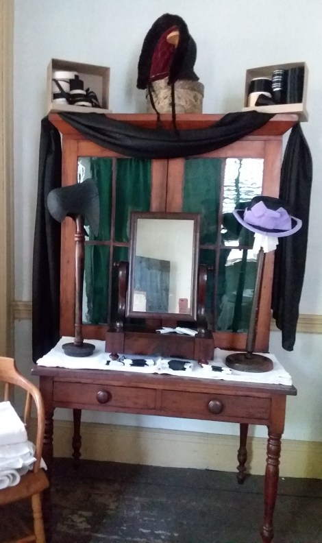
Okay, so, self critical honesty moment. I have mixed thoughts on the bigger display corner. This, to me, is supposed to be the “talk about examples”. Meaning when visitors come in, I want to be able to say “here is an example of such and such” or “see how this is different from this?” or “here, let’s take a closer look at this.” it didnt2 meet those neexs for me this year like it has in previous years. (recall I sold most of my demo pieces during the Clara emergency.)
I love the pink and blue stands. I want more pink. I kinda want some mint green like the outside of the building too. I also like the fashion plates hanging. I do not like the assortment of pieces I brought because they do not represent some of the things I like to talk about most. This is missing a coarse bonnet, a cottage bonnet, a wide brim hat, a bonnet with a veil, and a hat with a veil. Unfinished soft crowns confuse people. I need fo make a cap style hat to be in the perminant display because people can connect with that. I do like bringing the additional table. It does need tlc.
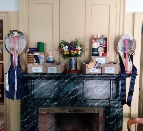
I am very pleased with the mantle display. It is a pretty, but also an informational pretty. I really like the labels. Vocabulary. I also like not opening all of them. They are all full. All but a couple are what they say. This means I am prepared for hair net, belt, and other emergencies, as well as closer looks. We didn’t get as many conversations that involved closer looks this year.
I hope you enjoyed my walk through my millinery and thought process. I may add a few more thoughts below. My apologies for typos. I am not used to this new tablet keyboard. My thumbs are too short.


I love the display. It looks very nice and inviting. If you ever figure out what topic will come up any certain year, let me know. It happens to me all the time. The things I think people will be interested in hardly get noticed and others go crazy. Hard to figure out at times. I hope to get to see your set-up in person some day.
Thanks.
We were talking about how the Saturday visitors just wanted to pop in, hear a summary, and go. There were very few questions and very few conversations. Sunday’s visitors were more conversational.