Straw Bonnet Critique

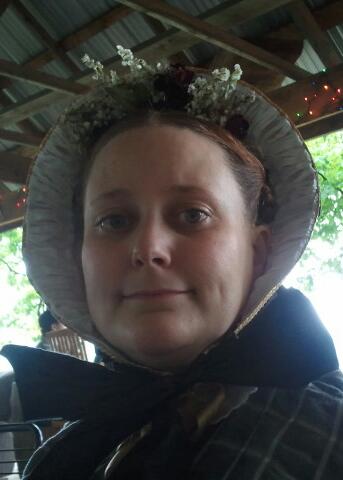
As I promised, here is a critique of one of my bonnets. I’m going to try to honestly cover the good, the bad and the ugly.

A little background first- This is a straw bonnet I made while in New Mexico. We were invited to an event at Ft Sheldon by some local friends. We had just a short time to pull everything together. I realized I didn’t have any millinary with me that was appropriate for the very sandy, red-dusty terrain I saw in photos. This bonnet was made in a few days out of materials I found in Alamogordo since there wasn’t time to order anything.

Now, a look at the materials. 

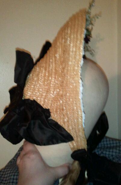
The straw came from a vintage hat from a thrift shop. It is just about 3/8ths of an inch thick and rather smooth. This is about as wide as I would suggest for a fashion straw bonnet. The width of the plait and the width of the split straw borders on what would have been considered ‘coarse’ in the 1850s and 1860s. The coarser the straw and plait, the cheaper. The finer the split straw the finer the plaits or other straw work can be and thus the more expensive. The straw plait was completely unsew from its original state, soaked to let the sewing holes fill back in then let to dry to an almost dry state. Then it was sewn back together into the bonnet.

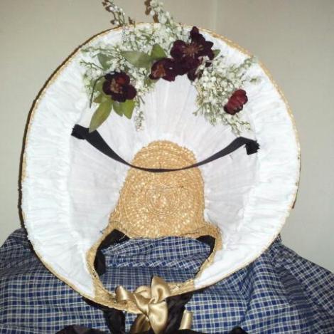
The white lining is made of white cotton voile I had on hand. I stiffened this with lots of my husband’s uniform spray starch despite it already having a fairly full body for a cotton sheer. (I’ll talk a little more about this later.) The spray starch method is not one I would normally use preferring a material with more body and stiffness already.

The flowers came from the local floral shop. They were the closest to natural looking I could find. These are rather sparse/thin for my preferences and what appears to be the level of fullness in period images
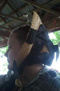
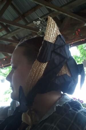
The ribbon and bavolet, or curtain, are silk taffeta I had in my stash. The ribbons are cut straight on the grain. The edges are frayed on the body of the bonnet and sized with a glue mixture to keep the silk from fraying more. While this can be seen in a few examples of extant bonnet, it is less common than ribbon which has a selvage edge. You would not see the ribbon fashion ties set on the bias.   The width, about 4″, is common for mid-century fashion bonnets. The ribbons are an adequate length. I would not suggest going any shorter. The ribbon does stand fairly well despite spending the mid-day out in the rain and thoroughly damp.The bavolet is cut and pieced on the bias. The bias in the bavolet helps with the fullness. As you can see in the side view of me wearing the bonnet the bavolet is rather limp. This is because I do not have any net backing the silk. If I had net, I would hem the net into the silk or tack it to the silk. Then I would pleat the top of the silk and net as one.

Just under the taffeta ties, is the silk functional ties. This is 1″ wide silk ribbon
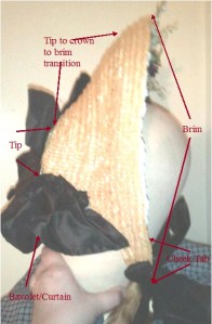
Now, let us look at shape and parts.

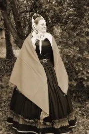
Looking at the side view of me wearing the bonnet, this is what happens when I put on a bonnet without a mirror, using the side of the car instead. The bonnet is angled backwards more than I would like. While it doesn’t need to be perfectly vertical, it certainly should be more vertical than this. To adjust what I see, I would sit the tip slightly higher on my small bun (I often wear my hair with braids flat against the back of my head, but opted for a bun instead which does stick out further from the back of my head.) with the top of the brim angled closer to vertical.

Looking at the overall shape of bonnets, one of the first things I see is the transition line from the tip though the crown to the brim. This should be a gentle transition not a drastic one. See how in this straw the transition has gentle curves? Compare that to this original straw bonnet which has a markedly deeper tip or this lovely original black straw

 As I noted the depth of the tip in the original compared to mine, we can look at that next. Yes, mine could be deeper. I think one or two rows of plait moving into the crown would make the difference. One thing to keep in mind when looking at the tips on straw bonnets is that they were not flat. Instead, they rounded from the back of the tip to the sides. Sometimes this was a small curve, other times it was more ball-like.
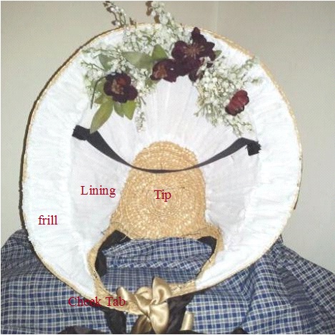
 The cheek tabs are an area that was quite the challenge when I started working with straw. At first they were thick and angular. But, as I looked at more bonnets, I saw cheek tabs were more narrow with a nice curve to them. Sometimes they were almost pointy.  

 Back to the frill. It isn’t frill enough to be a true frill. I would much rather have another layer of stiffer material double box pleated with the raw edges filling the edge of the brim. When thinking frill, think full and three-dimensional. The flowers need to be much fuller too.

The black across the inside is the velvet band that holds the bonnet on my head. I love these. They work wonderfully. Even with the bonnet perched at the odd angle on my head, the rain coming down and repeatedly wacking myself in the bonnet with my umbrella, the bonnet stayed put without feeling like it wanted to move at all thanks to this strip.

I’m sure there is more I can pick apart on this. But, that is all for tonight.

Published in: on June 13, 2012 at 5:06 pm  Comments (2)  
Tags:

Straw Bonnet Critique

When someone asks for an opinon on a bonnet, it can be difficult to try to explain what is not quite right about a bonnet for a variety of reasons – technology based conversations, trying to be sensitive, not knowing who will take offense, etc. Well, this is the bonnet I made in NM out of what I could find at the local shops in a couple days for an event we never actually made it to. I’m going to go through it this week talking about the shape, materials… basically ‘the good, the bad and the ugly.’

image

image

image

image

Published in: on June 11, 2012 at 5:34 am  Leave a Comment  
Tags:

Fanciful Utility News!!!!

Fanciful Utility: Victorian Sewing Cases & Needle-books

Take a look at the lovely Video Liz has put together…

… there is a special announcement at the end!!!

Published in: on June 4, 2012 at 4:12 pm  Comments (4)  
Tags:

Anatomy of a Bonnet

There is a helpful little file here for developing a better understanding of late 50s & early 60s millinery. Use it alongside browsing museum collections.
https://annaworden.wordpress.com/welcome/pdf-pages/

Published in: on May 29, 2012 at 7:39 pm  Comments (1)  
Tags:

A little survey

I’m trying to figure out what size shawls people are looking for. This is for wool, silk, sheer & domestically made shawls. Please let me know if you would prefer:
A) a square shawl 36″ square (this is called a handkerchief shawl)
B) a rectangular shawl about 40″ by 80″ (this is called a three-quarters shawl)
C) a square shawl less than 50″ square
D) a square shawl between 50″ and 55″
E) a rectangular shawl 50″x100″ to 55″x110″
F) a square shawl between 55″ and 60″ square
G) a rectangular shawl 55″x110″ to 60″x120″
H) a square shawl between 60″ and 65″ square
I) a rectangular shawl 60″x120″ to 70″x140″
J) a square shawl greater than 70″ square
K) a rectangular shawl greater that 70″x140″

Published in: on May 9, 2012 at 6:20 am  Leave a Comment  

Shawls on Etsy!

Just a quick note with a proper post later including photos.
I finally have 5 of my shawls listed on Etsy. There are 5 100% wool shawls including a brown & blue plaid, two natural white, a red and blue. Each are light weight, ideal for spring & fall as well as chilly summer nights.
Enjoy!

Published in: on May 4, 2012 at 6:28 am  Leave a Comment  

Embroidered Shawl Update

Thank you all who selected their favorite embroidery choices in the previous post. Since I already loved #3 and several of you like it as well, that is the one I’m going to work from. #3 is a nice balance of floral and paisley.
I’ve blown up the image and sketched out the design. (You’ll see a rejected larger cone motif on the right.) The wool is thin enough to see the illustration through. This will make tracing the design on to the wool to follow fairly easy. I just need to decide whether to trace out the enirety or the major lines then section by section. I’m leaning towards the latter.
For colors, I am thinking a duo or trio of greens and blues. Since the original is red, I may use a brown instread of the pale yellowish color for the vining bits. I may also accent with a red yet to be determined. I don’t know if the brown should be reddish or something paler. We shall see.

image

Published in: on April 5, 2012 at 6:13 am  Leave a Comment  

Painting on Velvet

Something odd has been happening lately. Over and over, I keep running into theorem pieces. It is even happening in the oddest of places including the dressing room of a second hand shop. (Granted, I know the manager and suspect she is why it is there.) The first little piece that I can recall is the cutest little shell pincushion at an antique show. The design was faded to almost not being there. Then came several more similar pincushions in a photo with very bright flowers still on the velvet. A couple weeks later I noticed the one in the dressing room. A few more glimpses later, I get a message from Eileen with a link to a photo in the OSV collection which has several items with small pieces of theorem.

All these little run-ins is making me quite a bit camp sick because theorem used to be a hit among the Pioneer Days campers at Stone Tolan House.

With that in mind, I just have to make some of these little shell pincushions with the theorem. I’ve been wanting to make the pincushions with the shells. I even have shells saved from our first anniversary. Now that I’ve been seeing so many with the theorem, I just have to do that bit as well.

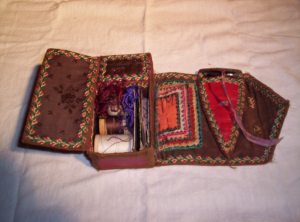
This little sewing case is darling with its theorem just inside the cover. It is also rather unusual to see the large pocket on the back side.  

Published in: on March 22, 2012 at 4:14 pm  Comments (5)  
Tags:

Chairs, Seats and Cushions, pt 3

This one should say Chairs and Sofas….

Another aspect of the chair seats I feel we need to look at is cushions. Take a look at what is said in The Workwoman’s Guide about cushions. (I’ll admit, I hadn’t thought about cushions to take to church.) Cushions and coverings not only made the chairs and sofas more comfortable, but protected them as well.

When chairs and sofas are fitted up with damask, merino, stuff, horse hair, or other material that does not wash, they are generally covered with Holland, chintz, or glazed calico, and protects them from dust and dirt, and are easily removed, when required for company. Holland covers are the most durable, but look cold; chintz to fit the chair or sofa, with or without piping at the edge, and with loops fastened down by passing one of the strings through the three loops, and making it tie. Ottomans generally have the covers to fit along beneath the edging of wood, in which case, they must be pinned to the stuffing with very strong pins, which from their length are called sofa pins.

Arm Chairs

It is a good plan to make a kind of case of Holland to fit half way down the cushion, A B C D, which protects the cover from being soiled by the head, on leaning back. Each arm chair should have two or three of these cases for wash and wear.

Church Basses

Flat circular ones are often in use. Sometimes straw ones are covered with green or crimson cloth, and look very neat. Basses may be filled with mill-puff, straw, chaff, bran, or bits of cloth, &c. Some persons prefer a simple cushion or flat pillow to kneel upon, in which case, they may be filled with feathers.

Church Seats

Church pews are generally lined with cloth, and fastened by brass nails andn binding laid on. The cushions, are oblong, and made like a very soft mattress.

They have pieces of cloth, bound round and sewed to them in front, to give an air of comfort and neatness  to the seat. The ground or floor is generally covered with a drugget of the same coulour as the lining of the seat.

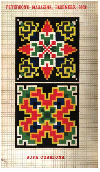
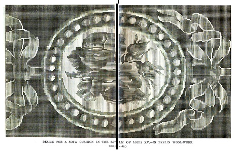
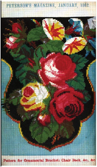
This color plate from Peterson’s shows two colorful sofa cushions.

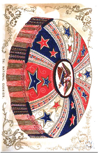
This patriotic cushion comes from an 1850 Godey’s rather than one during the CW.

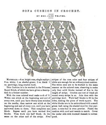
This is a crochet cushion from Petersons in 1862.

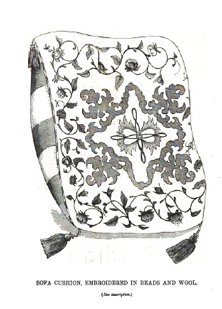
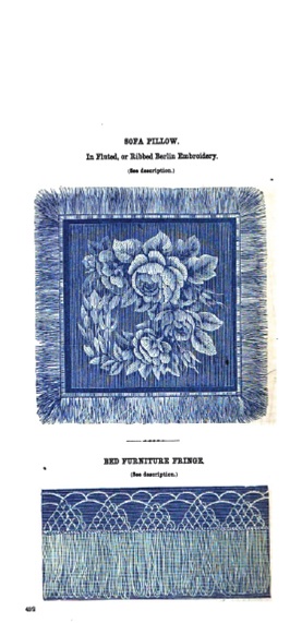
 1857 was a popular year for chair and sofa cushions in Godeys with these three included:

Published in: on February 13, 2012 at 1:07 am  Leave a Comment  

Chairs, Seats and Cushions, pt 2

Based on the number of color plates found in Peterson’s and Godey’s in the 1850s and 1860s, I would like to assume there was some level of popularity in making chair seats. This chair seat shows the curved edge shape generally seen with some variation in the publications. Worked in needlepoint, it has a floral pattern that covers nearly the entire seat.

While the previous seat is symmetrical, this chair back is asymmetrical in its floral design.  

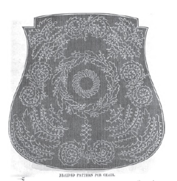
This seat, done in braid, is from Peterson’s 1857. You can see the notches at the top where the seat will fit into the wooden construction of the chair. I would like to find extant examples of a braided seat to see how well they did or did not wear.

When I saw this faded, horribly scanned seat design, I just had to share it. I pieced it back together from Google Books’ edition of Peterson’s. The symmetrical geometric design has a sorta southwest feel to me. Now, I highly doubt that is how those originally reading the magazine, looking at this illustration would have seen this though.  

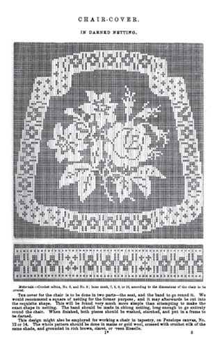
 This chair cover also has the distint shape of the chair’s seat.

Published in: on February 8, 2012 at 1:59 am  Comments (2)